Motion Design
about the project
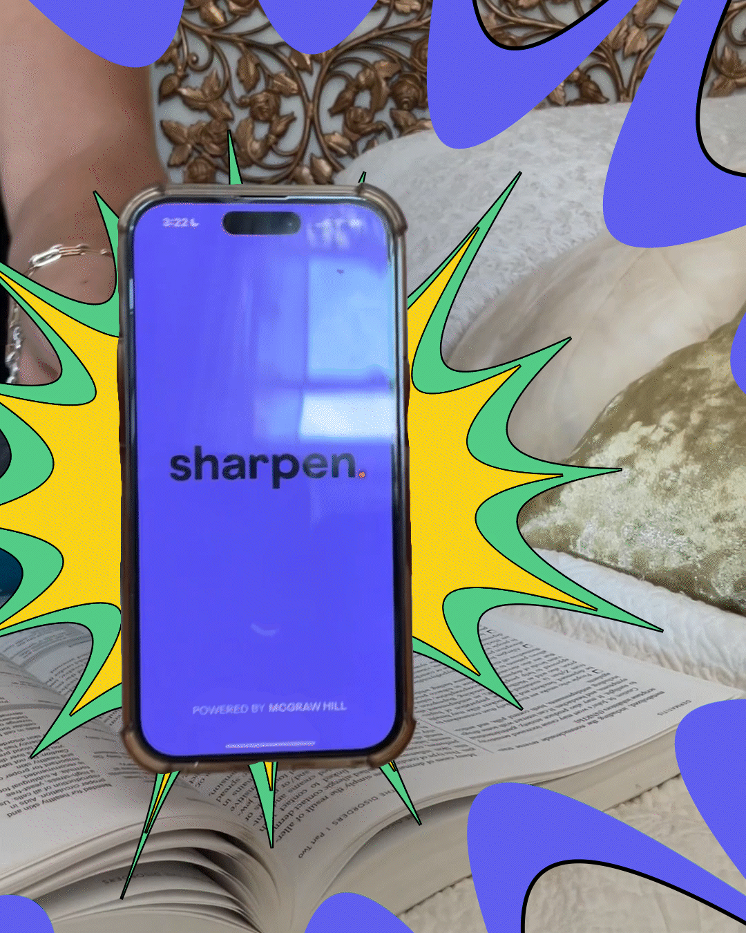
Sharpen App needed a creator-native paid social execution that could feel organic while still delivering clear brand presence. The main goal was to maximize retention and readability on mobile — without breaking the UGC tone — and finish with a conversion-driven end card.
the concept
This execution focuses on scroll-stopping readability: a strong hook, clear pacing, and a visual hierarchy that supports the voiceover. I kept uniform animation timing across overlays to create consistency and reduce cognitive load, so nothing “pops” in a way that feels foreign to the UGC.
The result is a creator-native edit with elevated branded motion — designed to keep attention, guide the viewer through the message, and land the CTA cleanly at the end.

conclusion
Sharpen’s visual identity is strong and instantly recognizable, so I used it as a retention tool. The explosion moment marks the transition to the app reveal, and the animated icon set turns feature highlights into fast, repeatable cues — improving clarity in-feed and making the full set of resources easier to remember.
ver também
Youtube Daniella Rolim
Supernova Duo | Colibri